


Every guide to styling floating shelves gives you the same four rules. Group in odd numbers. Vary the heights. Layer front to back. Leave negative space. They are all correct, and they are all too vague to act on, which is why a shelf styled to those rules can still look wrong and you cannot say why.
This guide puts numbers on them. How tall is too tall, how full is too full, how much weight the bracket behind the wall will actually take, and what to do when the shelf still looks off after you have followed every rule.
Start with the shelf, not the stuff
Two measurements set the ceiling on how good the styling can look, and both are decided before you place a single object.
Depth. Most floating shelves are 6 to 10 inches (150 to 255 mm) deep. Under about 6 inches you cannot layer anything, because there is no front to back distance to layer into, and every guide's advice about depth becomes irrelevant. Around 8 inches you can put a small object in front of a larger one. Above 10 inches, the shelf starts reading as a surface rather than a ledge, and needs more on it to look intentional.
Vertical spacing between shelves. This is the one people get wrong. If shelves are stacked, 12 to 16 inches (305 to 405 mm) apart works for mixed decor. Closer than 10 inches and you can only display short objects, which flattens the whole arrangement. Wider than 18 inches and each shelf floats alone rather than reading as a group.
If the shelves are already installed and spaced tightly, accept it and style for it: low objects, more horizontal repetition, no tall vases. Fighting the spacing is what produces the cramped look.
The three part fill rule
The most useful single number in shelf styling. Divide each shelf into thirds by visual weight:
- One third books and framed pieces. The structural, rectilinear elements. They give the eye something to rest against.
- One third decorative objects. Vases, sculptures, plants, bowls, boxes. The variety.
- One third empty. Actual air, not "a bit of space between things."
The empty third is what separates a styled shelf from a full one, and it is the first thing people sacrifice. If you own more decor than fits at two thirds density, the answer is rotation, not compression. Store the rest and swap seasonally.
A practical cap that goes with this: no more than about seven distinct objects per shelf of standard length, counting a stack of books as one object. Past seven, the eye stops seeing an arrangement and starts seeing a collection.
Height, weight, and the anchor you cannot see
Height. On a stacked shelf, the tallest object should not exceed roughly two thirds of the gap to the shelf above. A 15 inch gap gives you about 10 inches of usable height. Go taller and the shelf visually compresses, which reads as crowding even when the shelf is half empty. On a top or standalone shelf you have more freedom, but the tallest item still wants to sit at one end rather than the centre, or it splits the arrangement in two.
Weight. This is the constraint nobody styling a shelf thinks about until something comes off the wall. A floating shelf's capacity is set by its mounting, not by the shelf itself. A shelf anchored into studs holds substantially more than the same shelf on drywall anchors, and the load is worse than it looks because a floating bracket puts everything on a cantilever: weight at the front edge multiplies the force at the wall.
Practical implications for styling:
- Heavy items (stacked hardbacks, stoneware, a large planter with wet soil) belong close to the wall, not at the front edge.
- If the shelf was not anchored into studs, treat it as decorative and keep the load light.
- This is the honest argument for lightweight decor pieces, printed, resin or hollow ceramic, on shelves you did not install yourself and cannot verify.
Build one shelf, step by step
Do this on one shelf before touching the others. Styling all of them at once produces a wall where nothing is finished.
1. Clear it completely. Same principle as any organizing job. Existing arrangements smuggle in old decisions.
2. Place the anchor object first. The largest, visually heaviest thing on the shelf. Put it about one third of the way in from one end, not centred. Centring an anchor object forces symmetry, and symmetry on a shelf reads as formal and static.
3. Add height at one end. A tall vase, a stack of books stood upright, a framed piece leaning against the wall. This creates the diagonal that every guide calls "varying heights" without explaining that the point is a slope, not random variation.
4. Layer front to back. Tall behind, short in front. A framed print leaning at the back with a small object in front of it is the single most reliable move in shelf styling, because it creates depth on a shelf that is only 8 inches deep.
5. Add one organic element. A plant, dried stems, a bowl of something. Straight lines and hard edges alone read as a display case.
6. Take one thing off. Genuinely. Whatever you put on last, remove it. Nearly every over styled shelf is one object past its best version, and the last thing added is usually the one that broke it.
7. Step back eight feet. Shelves are never viewed from eighteen inches away, which is where you have been standing. From across the room, small objects vanish and gaps you thought were too big read as balance.
Ideas by room
Living room. The most common arrangement is a pair of shelves above a sofa or flanking a television. Above a sofa, keep the bottom shelf at least 10 inches above the back cushions so it does not feel like a hazard. Around a television, treat the shelves as a frame: the arrangement should get lighter as it approaches the screen, so nothing competes with it.
Kitchen. Open kitchen shelving works when it holds things you use, because used objects get handled and stay clean. Dust and grease settle on decorative pieces in a kitchen faster than anywhere else. Keep the palette tight, two or three colours across all shelves, or the arrangement reads as clutter no matter how carefully placed.
Bathroom. The strongest bathroom shelf move is rolled towels plus two or three containers holding what you actually use. Humidity is the constraint: it warps untreated wood, rusts unsealed metal, and grows things in porous surfaces. Sealed, wipeable objects only.
Home office. The shelf above a desk has a job to do, and its styling should follow the job. Reference books, one plant, one piece of art, and a container for the small things that otherwise live on the desk surface. Anything purely decorative competes for attention with your work. If the small things keep migrating back onto the desk, the shelf is not the problem and the drawers are: see How to Organize Desk Drawers.
Entryway. Small, functional, one shelf. A tray for keys, a small plant, one framed piece. The entryway shelf fails by accumulation faster than any other, because everything you carry in tries to land there. The tray is what saves it: it gives incoming objects a boundary.
Colour: the fix nobody mentions
Here is the most common reason a shelf looks wrong after the owner has followed all the standard advice correctly. The proportions are fine, the heights vary, there is negative space, and it still looks like a jumble. The problem is that the objects have nothing in common.
A styled shelf usually contains six or seven objects from six or seven different sources, bought at different times, in whatever colour they came in. Individually appealing, collectively unrelated. Odd numbers and layering cannot rescue an arrangement with no shared thread.
The thread is usually colour, and there are two ways to build it:
- Repeat one accent across the shelf. Pick a colour that already exists in the room and place it at three points in the arrangement, in three different forms. The eye connects them and reads the shelf as one composition.
- Keep a neutral base and allow one contrast. Two or three neutrals, white, wood, black, stone, plus a single saturated accent. This is the safest version and the reason so many magazine shelves look effortless.
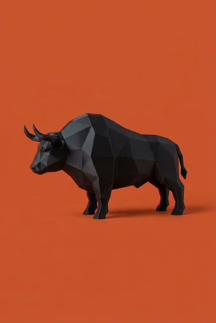
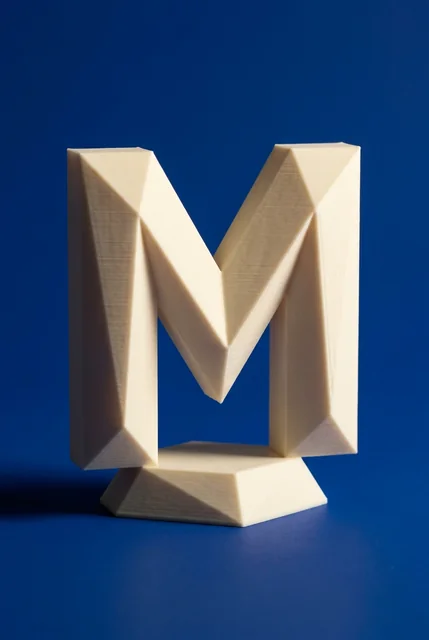
This is where printed decor has a genuine, unglamorous advantage over most alternatives. Because pieces are printed to order, you can take three different shapes, a vase, a bookend and a small sculpture, in exactly the same colour, which is very hard to do buying ceramics from different makers. We print in twenty colours, which is enough to match an existing accent in the room rather than approximate it. Existing pieces can also be resized so nothing overhangs the front edge of a shallow shelf, within the size ceiling of a single printed part, and larger objects are split into sections that assemble. And printed pieces are light, which matters on a shelf whose anchoring you are not certain about.
That is a narrow use case, not a claim that printed decor beats ceramic. It solves one specific problem: repeating a precise colour across different shapes.
Common mistakes
- Everything the same height. The most frequent error. Produces a flat line the eye skips over.
- Everything at the front edge. Pushing objects forward for visibility flattens the shelf and puts the load in the worst possible place for the bracket.
- Symmetry on every shelf. Matching arrangements on stacked shelves read as a store display. Vary which end is heavy.
- Too many small objects. Five small things read as clutter where one large thing reads as intent. Small objects work in front of larger ones, not on their own.
- Styling for the photo. A shelf that looks perfect and cannot be touched will be undone within a month. If the shelf is in a room you live in, build it so a book can come off it without wrecking the arrangement.
Frequently asked questions
How far apart should floating shelves be?
12 to 16 inches (305 to 405 mm) for mixed decor. Closer restricts you to short objects; wider makes the shelves read as separate rather than as a group.
How much weight can a floating shelf hold?
It depends on the mounting, not the shelf. Anchored into studs, a standard bracket holds considerably more than the same shelf on drywall anchors. Because floating brackets cantilever, weight at the front edge stresses the mount far more than the same weight near the wall. If you did not install it and cannot confirm the anchoring, keep the load light and near the wall.
How many items should go on a floating shelf?
About five to seven objects on a standard length shelf, counting a stack of books as one. Roughly a third of the shelf should stay empty.
What should I put on floating shelves in a living room?
A mix of structure and softness: books or framed art for structure, one or two decorative objects, one organic element such as a plant or dried stems, and empty space. Keep the palette to two or three colours plus a single accent.
Should floating shelves match the wall colour?
Matching the wall makes the shelf recede and puts all attention on the objects, which suits a busy arrangement. Contrasting makes the shelf itself part of the design, which suits sparse styling. Neither is wrong, but decide which one you are doing.
How do I make a shelf look less cluttered?
Remove a third of what is on it, then check that the remaining objects share a colour thread. Clutter is usually a variety problem rather than a quantity problem: seven related objects look composed, four unrelated ones look messy.
Print Foundry is a 3D printing studio in Anaheim, California, making home decor, sculptures and LED candle holders in PLA across twenty colours, sized to the space they go in. Resizing an existing piece to your shelf goes through custom orders. Browse at printfoundry.studio or on Etsy.