



Most bookshelf advice is written as if you were decorating one shelf. You are not. You are composing across five or six of them at once, stacked vertically in a single frame, and the eye reads the whole unit before it reads any individual row. That is why a bookcase can be full of nice objects and still look wrong: every shelf was styled well, and no two of them were styled in relation to each other.
The second thing that makes a bookcase different from a wall shelf is that you already own the material. Books are not accessories you go shopping for. They arrive in their own colours, in mismatched heights, in quantities you did not plan, and any styling approach that treats them as a problem to hide will lose to the books eventually. If you want a shelf with three carefully chosen objects on it, that is a floating shelf, and the rules are different — we covered those in Floating Shelf Ideas.
So this is about the whole case: how to divide it, what to put down first, and how to keep the books.
Empty it, and photograph the empty case
Take everything off, including the books, and wipe the shelves down. Then take a photo of the bare unit from where you normally stand.
The photo matters more than it sounds. A bookcase is a grid of rectangles, and the proportions of those rectangles — how wide, how tall, how many — determine what will fit and what will look cramped. Standing in front of it you see furniture. In a photo you see the grid, and you can count it.
While it is empty, deal with two things you cannot fix later. If the unit is tall and not fixed to the wall, anchor it now; a loaded bookcase is a genuine tipping hazard and every styling decision after this assumes it stays upright. And if you have ever wanted to paint or paper the back panel, this is the only convenient moment. That single change does more for a bookcase than any amount of rearranging, and we come back to it below.
Count your slots before you place anything
Take each shelf and divide it mentally into equal sections — two on a narrow unit, three on a standard one, four on a wide one. Each section is a slot, and a slot holds one arrangement: a stack of books, a vase, a basket, a framed photo with something leaning on it.
Now count. A six-shelf case divided in three gives you eighteen slots. That number is the whole budget for the unit, and knowing it changes how you shop and how you edit, because "I need something for the shelf" becomes "I have four slots left."
Two rules make the grid work rather than just organise it:
- Not every slot gets filled. Aim to leave roughly one in five empty. Empty slots are what makes the rest look chosen instead of stored.
- No two shelves get the same count. If the shelf above holds three arrangements, the one below holds two or four. Identical counts row after row read as a filing system, which is exactly the look people are trying to get away from.
The grid is a starting position, not a cage. Objects can overlap the invisible lines and should. What it prevents is the default failure, which is lining everything up in an even row along each shelf.
Anchors first, decoration second
Place the big, heavy, visually solid things before anything small: tall stacks of books, baskets, a large vase, a boxed set, a framed print leaning at the back. These are anchors, and they do two jobs — they hold the composition down, and they give smaller pieces something to sit against.
Spread them diagonally rather than in a column. If your largest anchor sits on the top left, the next one goes middle right, the next bottom left. A vertical stack of heavy objects makes one side of the case feel like it is sinking, and it is a surprisingly hard problem to diagnose once everything else is in place.
Balance here means visual weight, not size. A small matte black sculpture carries more weight than a pale ceramic bowl twice its size, because contrast is what the eye measures. Dark, dense, high-contrast objects count for more than their footprint suggests, which is useful: you can correct a lopsided case with one small dark object rather than moving furniture.
What to actually do with the books
Books earn their slots in three positions, and mixing all three across the unit is what stops a bookcase looking like storage.
- Upright, ordered by height. The default. Tallest at the outside edge, descending inward, held by a bookend rather than trailing off into a lean.
- Stacked flat. Two to four books lying down, largest at the bottom, with a small object on top. This is the single most useful move in shelf styling: it creates a pedestal at exactly the height a small object needs, and it uses books you were going to store anyway.
- Facing outward. One book per shelf at most, cover forward, propped at the back of a slot. Treat it as artwork, not as a second row.
On sorting by colour: it photographs beautifully and it costs you the ability to find anything. If the case holds books you actually reference, sort by subject and let the colours fall where they fall. Rainbow ordering earns its place on a display case in a hallway, or on a single shelf used as a colour block within an otherwise practical unit.
If you own more books than the case holds, that is a real constraint and not a styling failure. Fill the lower shelves densely and honestly, and reserve the top two — the ones at eye level and above — for the mixed arrangements. Nobody looks at the bottom shelf of a bookcase.
The objects that earn a slot
Roughly one slot in three should be something other than books. Fewer and the unit reads as a library; more and the books start looking like filler between the ornaments.
What works, in rough order of usefulness:
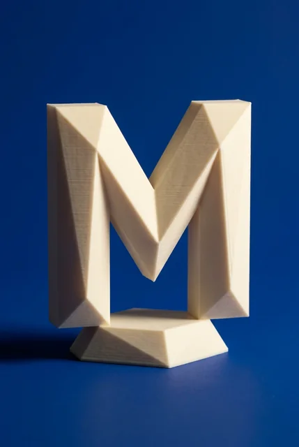
- Bookends that are actually objects. The one accessory the case genuinely needs, so it may as well be something you want to look at. A sculptural bookend does the job of a decorative object and holds the row up at the same time.
- One tall vertical per shelf. A vase, a candlestick, a tall figure. It breaks the horizontal rhythm of book spines.
- Something living. One or two plants across the whole unit, on shelves that get light. Trailing plants soften the hard edge of a shelf better than anything else.
- Boxes and lidded containers. They look intentional and they hide the cables, chargers and paperwork that would otherwise sit on top.
- Personal objects with an obvious story. Souvenirs, a trophy, something handmade. These are what make the unit look like yours rather than staged.
Keep materials to about three across the case — say wood, ceramic and metal — and repeat each one at least twice on different shelves. Repetition is what ties a grid together; a single object in a material that appears nowhere else reads as a mistake.
This is where a print shop is genuinely useful, because the pieces a bookcase needs are small, sculptural and easy to size. We print sculptures and figures and vases, planters and decor in a 20-colour palette, which means you can pick the same colour across three shelves instead of hunting for it in shops. Bookends, vases and small figures are the three that do the most work. If a piece is close to right but wrong for your shelf height, a custom order can rescale an existing model, up to about 320 mm on a single part.
The back panel and the light
Two changes beat any amount of rearranging, and almost nobody makes them.
The first is the back panel. Painting the interior back a colour darker than the frame, or lining it with wallpaper, turns the case from a piece of furniture into a backdrop. Everything you place gains contrast, pale objects stop disappearing, and the unit reads as deliberate before a single item goes on it. If painting is out, the removable version is peel-and-stick paper or fabric panels cut to shelf width.
The second is light. A bookcase is deep and its own shelves shade it, so the middle rows sit in shadow no matter how bright the room is. Picture lights mounted above, or slim battery strips under each shelf lip, fix a problem most people try to solve by adding more objects.
Depth is the related lever. Because a bookcase is deeper than a wall shelf, you have front-to-back space to use: push books to the back edge and stand a small object in front, or pull a stack forward and leave shadow behind it. Alternating that across the case gives it dimension that no amount of left-to-right rearranging produces.
Bookcases that are also storage
Most bookcases are doing a job as well as looking like something — holding files, board games, a router, kids' things. Styling advice tends to pretend otherwise.
The workable split is by height. Everything functional goes below waist level, contained in matching boxes or baskets so the eye reads one rectangle instead of twelve objects. Everything display goes at eye level and above. Matching containers are not a decorating flourish here, they are the mechanism: identical fronts across a whole shelf turn clutter into a band of texture.
If the case sits in a working room, the same reach logic applies as at a desk — what you use daily goes at hand height, what you look at goes above. That principle is worked through in How to Organize Your Desk.
Check it in a photo, in black and white
When it is done, photograph it again from your normal standing position, then convert the photo to black and white.
Colour hides compositional problems. In greyscale you see only value — light against dark — and the two most common faults become obvious: everything at the same mid-tone so the case reads as mush, or all the dark mass gathered on one side. Both are fixed by moving three or four objects, and neither is visible to the naked eye while you are standing in front of the shelves.
Then leave it for a week before adjusting. A bookcase is used, not just looked at, and after a week the books that get pulled and the objects that get moved will have told you which slots were wrong.
Frequently asked questions
How many items should go on each bookshelf?
Two to four arrangements per shelf, depending on width, with the count varying between shelves rather than repeating. Count arrangements, not objects — a stack of books with a bowl on top is one arrangement, not two. Aim to leave about one slot in five empty across the whole unit.
What is the ratio of books to decor on a bookshelf?
Roughly two slots of books to one of something else. Below that the unit stops reading as a bookcase; above it the books look like packing material. The ratio matters less than the distribution — mix them on every shelf rather than dedicating whole shelves to one or the other.
Should I organize books by colour?
Only on a case you do not use for reference. Colour ordering looks excellent and makes any specific book hard to find. A good compromise is one shelf as a colour block within a unit that is otherwise sorted by subject.
How do I decorate a bookshelf when I have too many books?
Fill the lower shelves densely and honestly, and use the top two or three for mixed arrangements. Add height variation with flat stacks rather than objects, and put one sculptural bookend on each visible row. Nobody expects the bottom of a bookcase to be styled.
How do I make a cheap bookcase look expensive?
Paint or paper the back panel a shade darker than the frame, add light from above, and replace the mixed plastic containers on the lower shelves with one matching set. Those three changes cost less than a single piece of furniture and are the ones that read from across the room.
Print Foundry is a 3D printing studio in Anaheim, California. We print sculptures and figures, vases, planters and home decor and organizers in PLA, in 20 colors. Material and care questions are answered on our FAQ page. Browse the catalogue at printfoundry.studio or on Etsy.